
By authorization of the chancellor, the Office of University Relations is responsible for all interpretation and control of institutional graphics and is charged with distinguishing North Carolina A&T State University from its competitors by maintaining a distinct brand image, strengthening the university’s brand and increasing brand awareness.
All communications and branding efforts must support the university’s mission of exemplary teaching and learning, scholarly and creative research, and effective engagement and public service.
The graphic (visual) identity program plays an important role in influencing the institutional image of the university. The more consistently the graphic elements are used, the stronger the visual identity; the stronger the visual identity and use of consistent names, the greater the awareness and recognition of the university.
Consistency, frequency and repetition are the most important principles in creating recognition. Because there is an assortment of preferences among users, it is crucial that the university adopts a stronger, more consistent use of its official logo, word marks and seal, while limiting the number and type of variations used by its units and constituencies.
The official university logos and word marks are trademarks of North Carolina Agricultural and Technical State University. Their purpose is to build visual identity in the minds of constituents through a uniform and recurrent presentation.
N.C. A&T faculty, staff, administrators and students are welcome to use the graphic symbols for official university applications, i.e., programs sponsored by the university and its associated entities and partners. The logos may be prominently displayed on promotional materials, including printed works.
The symbols give proprietary identification to the university; therefore, usage is restricted to recognized entities of the university. Personal use of the official university trademarks is prohibited, and permission for said usage will not be granted.
A&T’s symbols include the official seal, logos and word marks that are covered in this section. Individual unit logos that are not part of the graphic identity system are not permitted.
The logos are available for campus users as digital files from the Office of University Relations. Each logo is indicated by its name and provided in an electronic file format that is usable in most software applications, such as Microsoft Office and Adobe Creative Suite. Files for special applications may be provided upon request. Private vendors wishing to use the symbols on revenue-producing merchandise must contact the Learfield Licensing Partners for rights and terms of use.
The university logos are not to be adjusted or modified in any way. The N.C. A&T logo should appear in the A&T color palette only and should be used on all core brand communications. Do not fill the logos with graphics or photos, do not cover the logos with text or graphics, and do not change or approximate the fonts or make transparent. Downloadable files of key elements are available below or in the Assets section of this site.
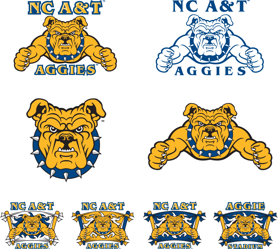
The 3-line university logo should be the primary logo used.

When vertical space is limited, the 2-line university logo should be the primary logo used.

When horizontal space is limited, the stacked university logo should be the primary logo used.
The icon may be separated from the university word mark when space is limited.

The logo must hold a prominent position in every external communication and stand apart from its surroundings. Maintain clear space around the logo to provide safety to set it off from adjacent text and images.

Clear space. Don’t crowd the logo. When using it, measure the height of the letter N in North Carolina. Design elements, type and photos should be at least that far from the logo.
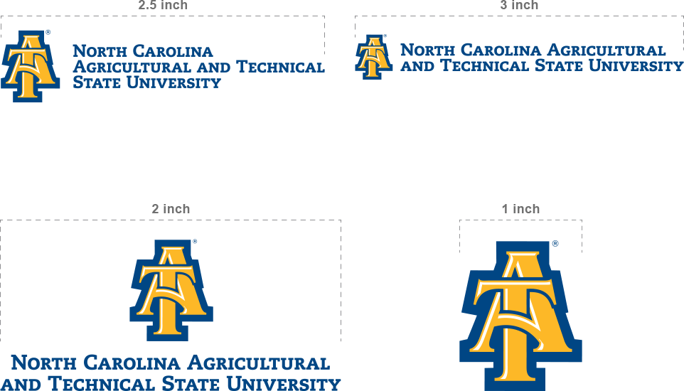
Minimum size. Use the appropriate size in all media, and remember to scale the logo proportionately. In print communications, use vector-based logos for highest image resolution.
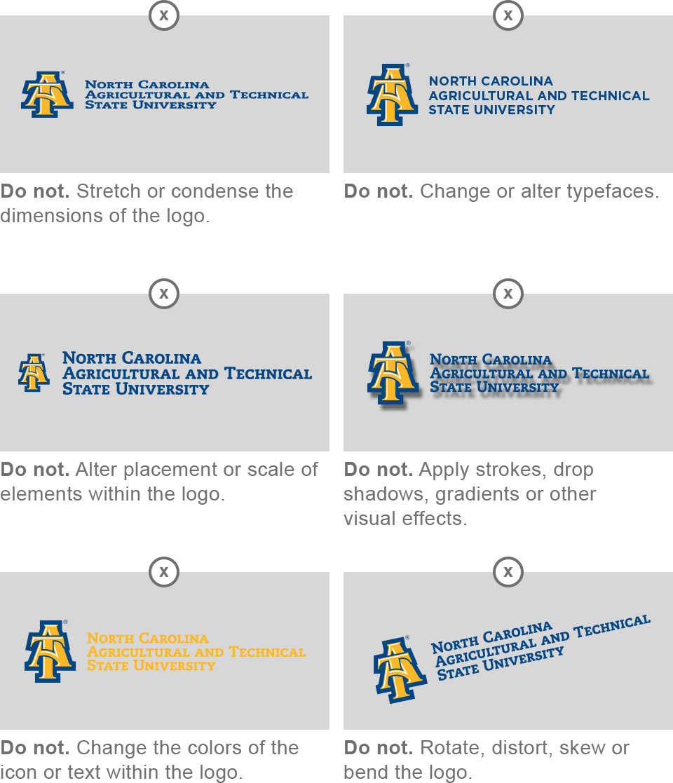
- The Letter Mark logo (interlocking A&T logo) must be used for all academic publications directly related to the literary, scholastic and technical aspects of the academy (e.g., brochures, view books, newsletters, magazines, e-publications, advertisements, CDs/DVDs) and events. This logo also may be used in publications and on paraphernalia whose purpose is to promote the university through athletics and other university approved extracurricular activities.
- The Letter Mark logo (interlocking A&T logo) must not be used as a substitute for the letters “A&T.”
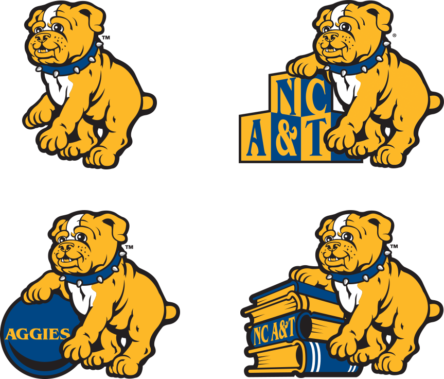
- The mascot and youth mark are school spirit symbols and should not be used for academic and research programs, or anything that is business or non-athletics related.
- Do not print university symbols in any colors other than PMS 288, PMS 123, black, white or gray.
- Symbols should be printed on a single solid color or white background. Symbols also may be printed in reverse (white) on a dark solid background. Avoid placing symbols on patterned backgrounds and “busy” photographs.
- Do not crop off any part of the Letter Mark logo or spirit symbols. University logos/symbols must appear in whole.
- Do not outline the symbols in part or in whole.
- Do not place type or illustrations inside/within, over or under the symbols.
- Do not print the symbols on top of other symbols, and vice versa.
- An official university symbol should not be used to create another logo, nor should it be part of another logo.
- When the university symbol appears with other logos/logotypes, A&T’s symbol must be the same size or larger than the other logos/logotypes.
- University symbols may not be reproduced smaller than one-half inch or three picas.
- The appropriate trademark symbol — TM or ® — must appear with university symbols.
The AGGIES DO logo and pre-approved action words are key to communicating the N.C. A&T brand identity. For a complete list of approved AGGIES DO action words, click here.
When vertical space allows, the stacked version of the AGGIES DO logo should be used, but only on a white, yellow or blue background. The stacked logo should never be placed over a photo or busy background. Downloadable files are available here or in the Assets section of this site.
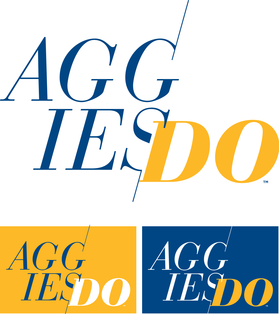
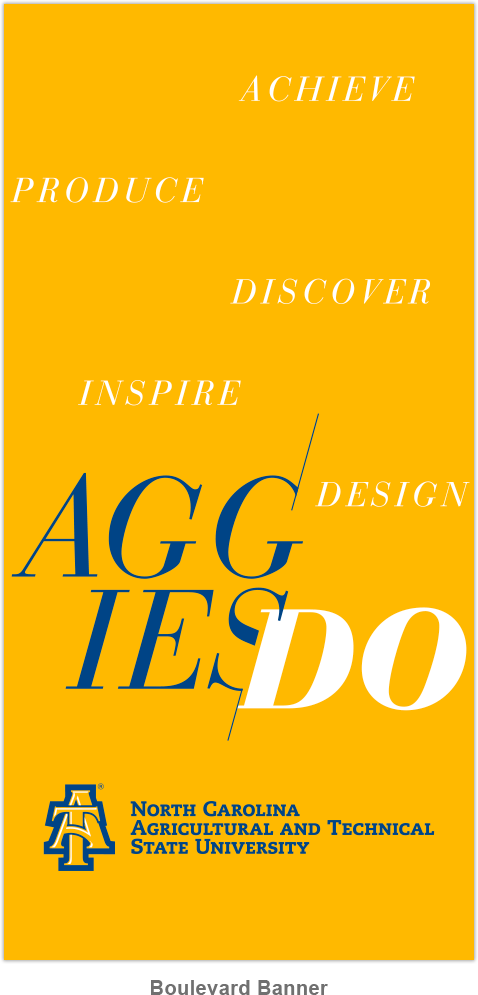
When vertical space allows, the stacked version of the AGGIES DO logo should be used, but only on a white, yellow or blue background. The stacked logo should never be placed over a photo or busy background. Downloadable files are available above or in the Assets section of this site. All pre-approved AGGIES DO action words are available here.
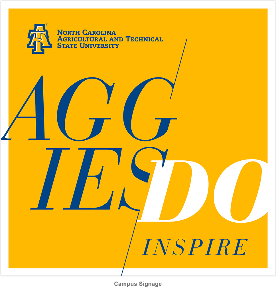
An alternative typographic option is provided for usage in more dynamic layouts, including busy backgrounds and photography. All pre-approved AGGIES DO action words are available for download here.

The university seal is intended for official documents and occasions such as diplomas, transcripts, legal documents, board of trustees reports, chancellor’s reports, resolutions and proclamations, commencement and convocation documents and honor society documents. It must not be used as a casual logo or identity, design element in recruitment materials or decorative element.
